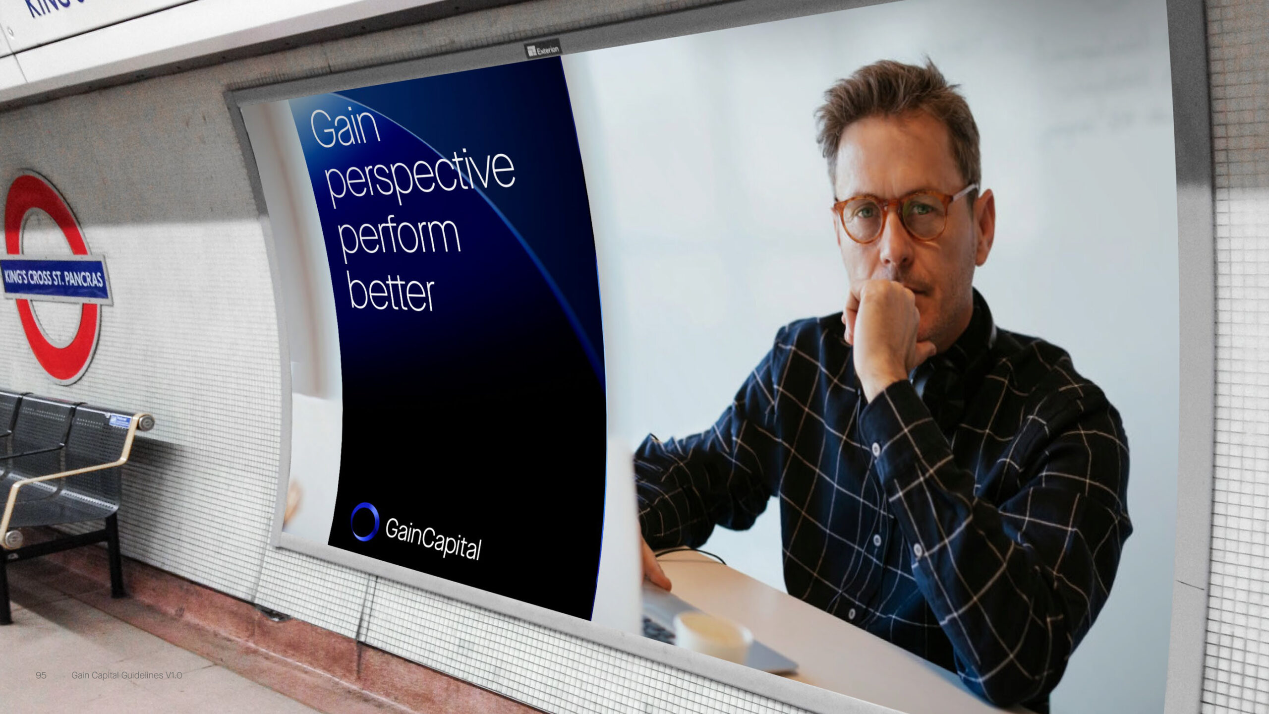
Rebranding and website redesign
Projective objective
Brand refresh to enhance user experience, improve conversion rates, and drive engagement through an updated UI and rigorous A/B testing of key design elements.
Client: Gain Capital
Date: 2019
Role: Lead Visual Designer, A/B Testing Strategist
Tools: Figma, Adobe XD, Google Optimize, Hotjar, Google Analytics
Existing brand review
I led the comprehensive visual redesign of Gain Capital’s digital presence, encompassing the entire website and email communications. My primary objective was to modernise the brand's visual identity and enhance user experience across all touch points.
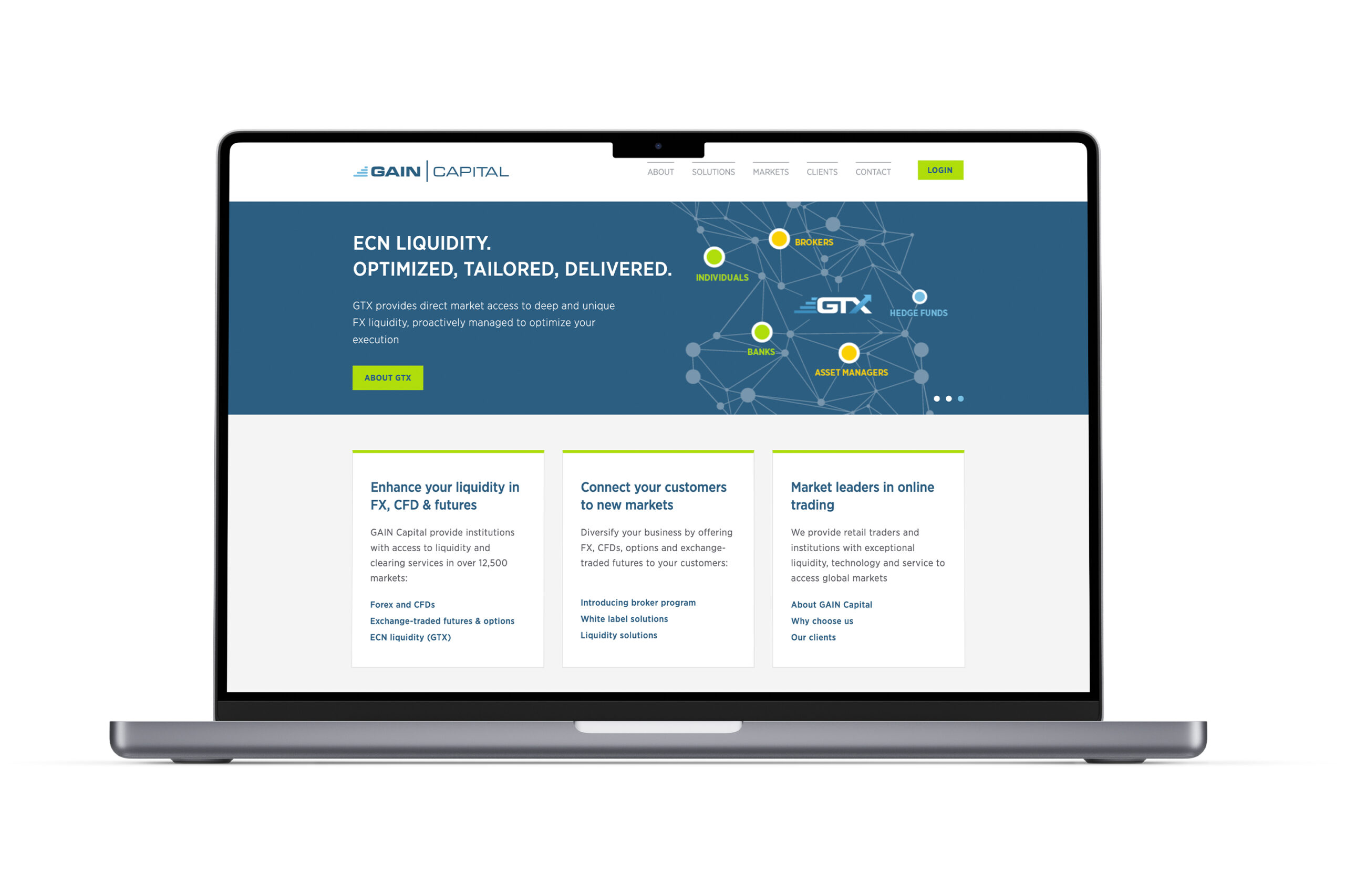
Challenges identified in the existing design:
The previous design featured a conservative colour palette and standard typography, lacking the boldness and visual appeal expected in modern financial websites.
The site did not fully adapt to various screen sizes, hindering usability on mobile devices—a critical aspect as mobile usage was on the rise.
Information was densely packed with minimal whitespace, and a complex navigation structure made it challenging for users to locate key information efficiently.
Email templates lacked visual consistency and alignment with the brand’s identity, leading to a fragmented user experience across different communication channels.
New brand design
This holistic redesign successfully transformed Gain Capital's digital presence into a modern, user-friendly platform that effectively communicates the brand's values and services, enhancing user engagement and aligning with current web design best practices.
The previous design featured a conservative colour palette and standard typography, lacking the boldness and visual appeal expected in modern financial websites.
The site did not fully adapt to various screen sizes, hindering usability on mobile devices—a critical aspect as mobile usage was on the rise.
Information was densely packed with minimal whitespace, and a complex navigation structure made it challenging for users to locate key information efficiently.
Email templates lacked visual consistency and alignment with the brand’s identity, leading to a fragmented user experience across different communication channels.

Component-based design approach
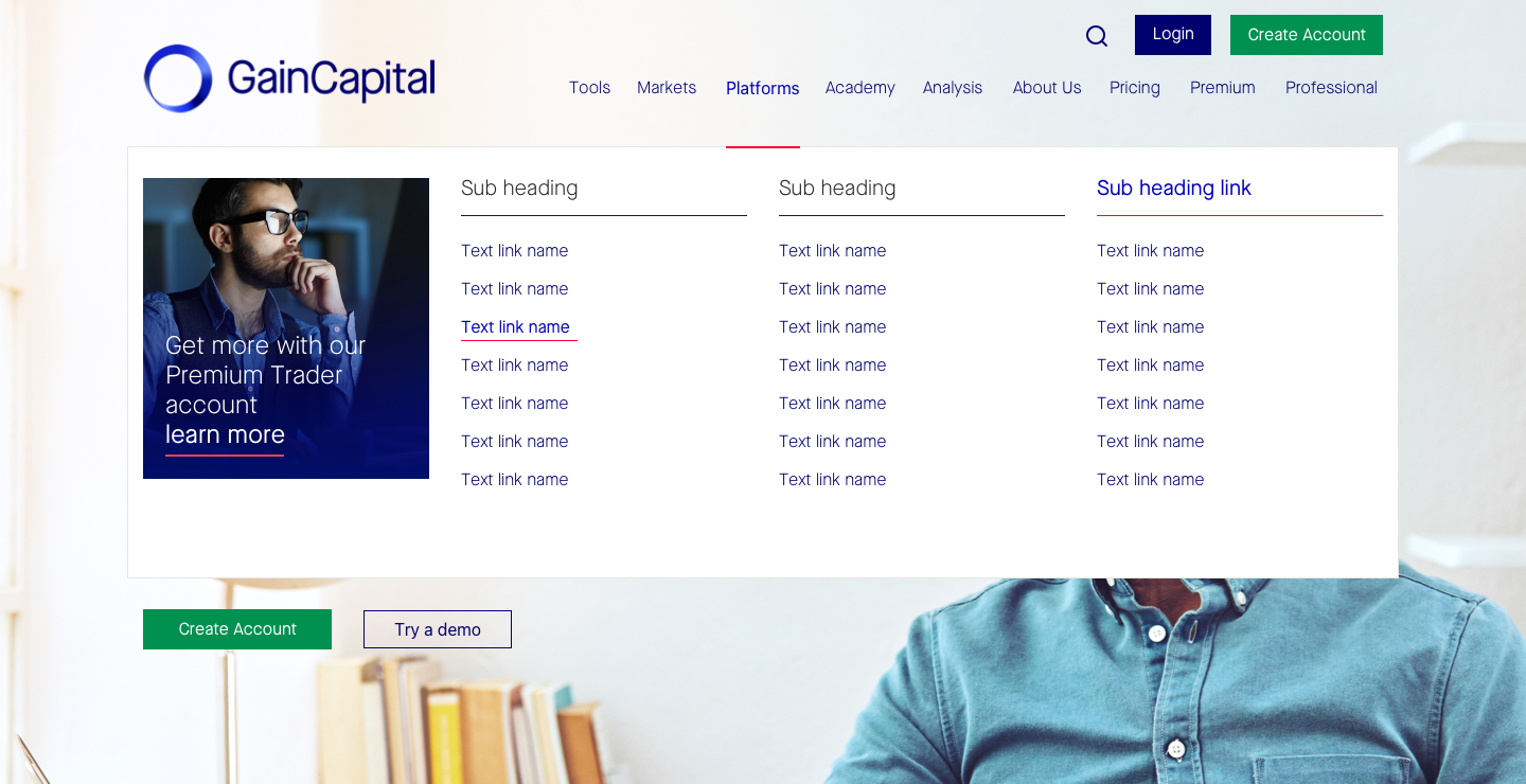
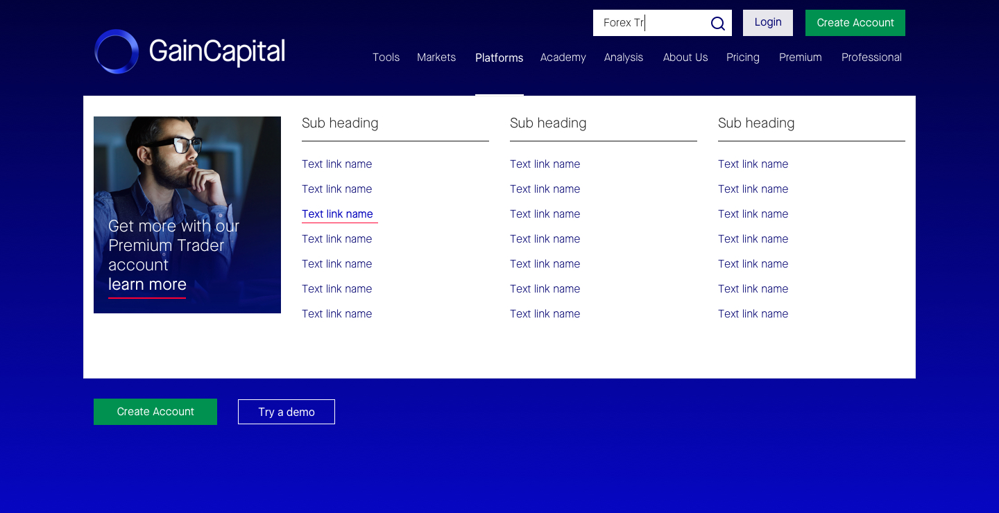
In the redesign of Gain Capital's digital platform, I adopted a component-based design approach. This methodology involves breaking down the user interface into modular, reusable components—such as buttons, forms, and navigation menus—that can be consistently applied across the website. By developing a comprehensive component library, we ensured uniformity in design elements, which streamlined the development process and enhanced the overall user experience.
1a. Navigation (large screens)
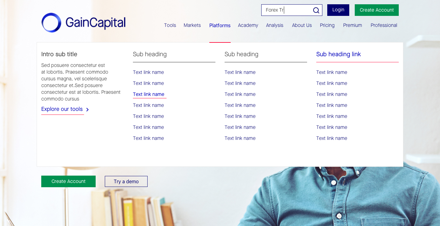

1b. Navigation (mobile screens)


2a. Hero sections (large screens)





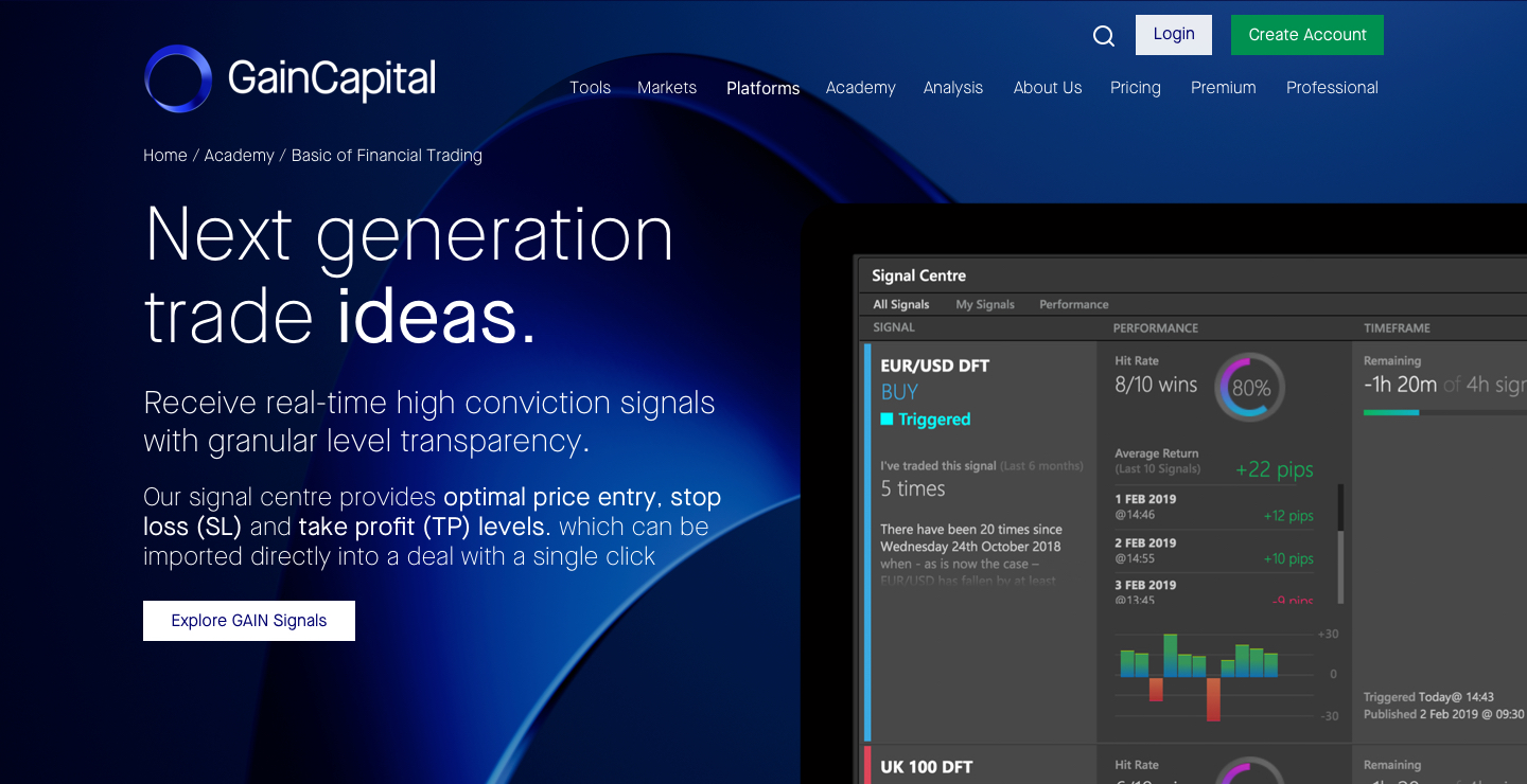

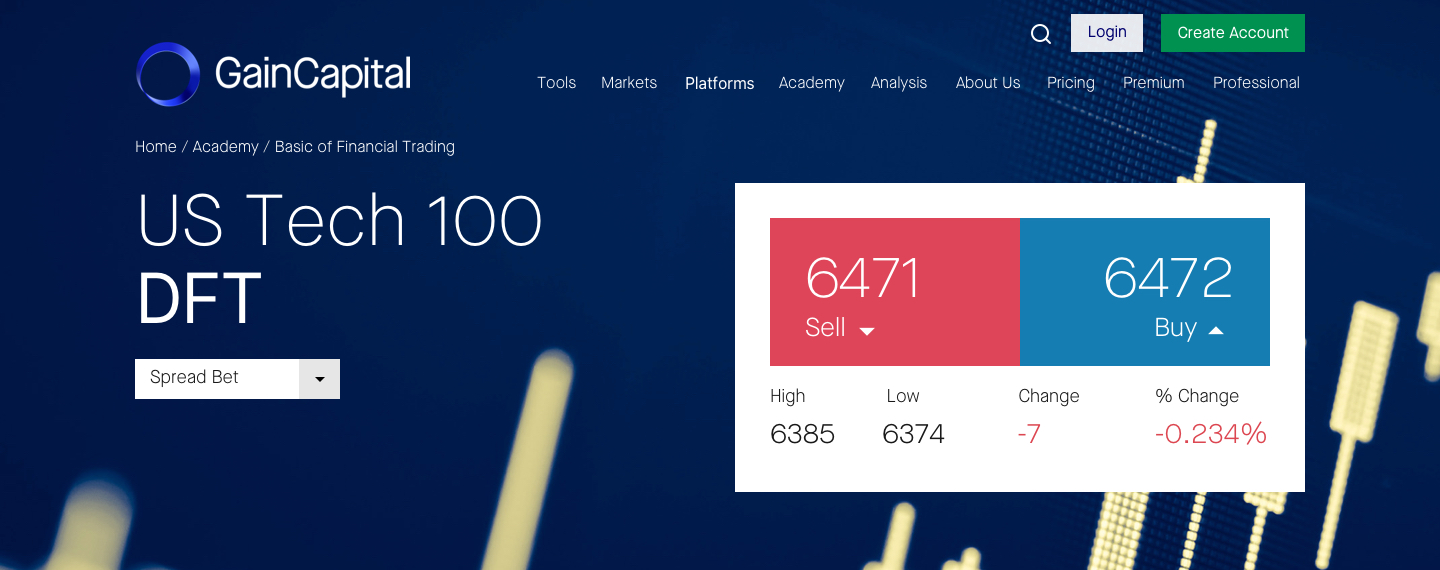
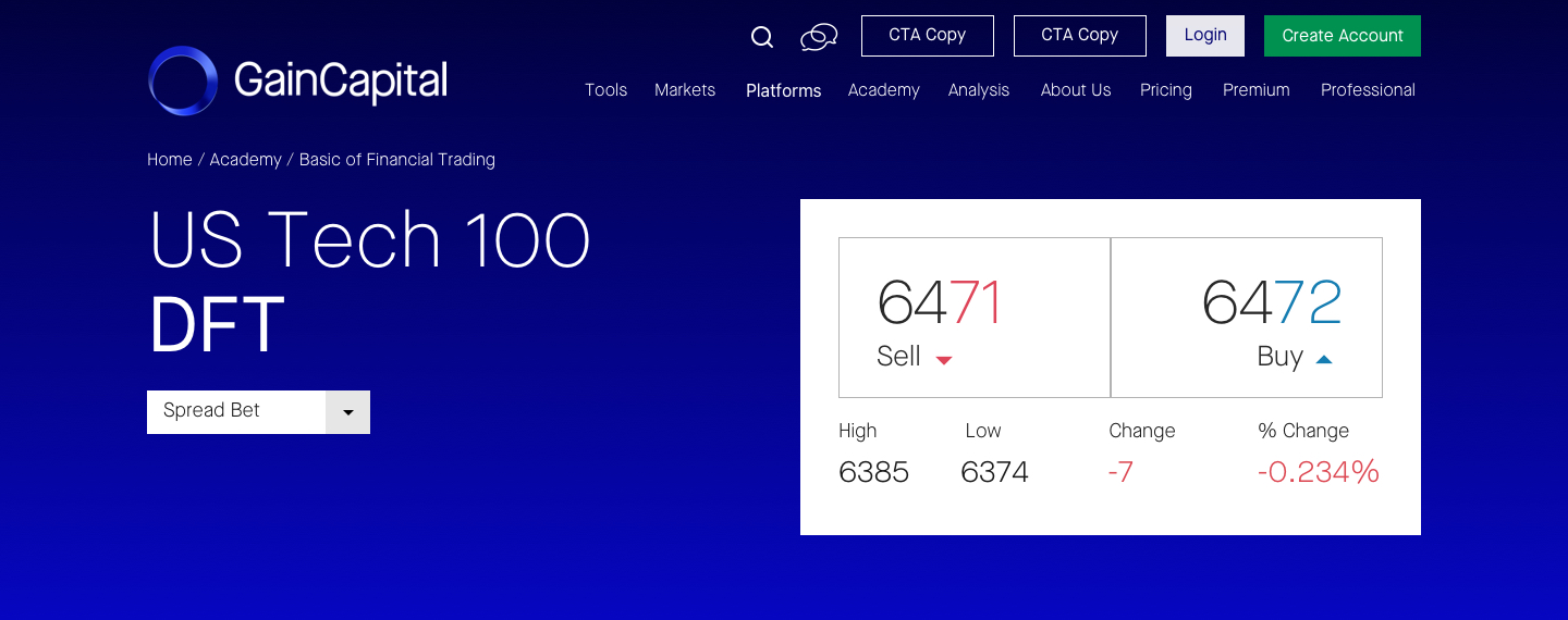

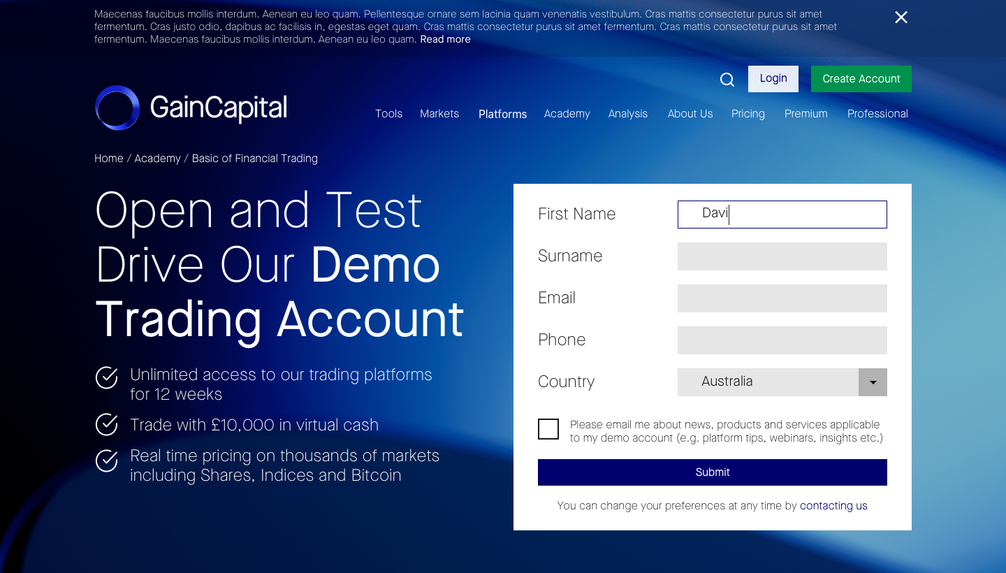

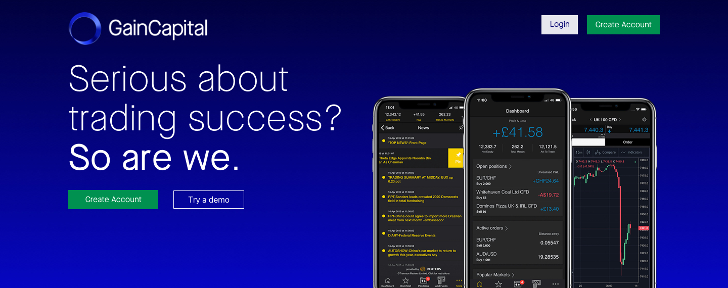
2b. Hero sections (mobile screens)

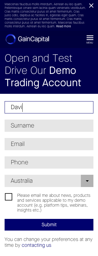


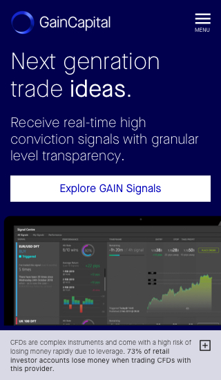



3a. Landing page design (large screen)


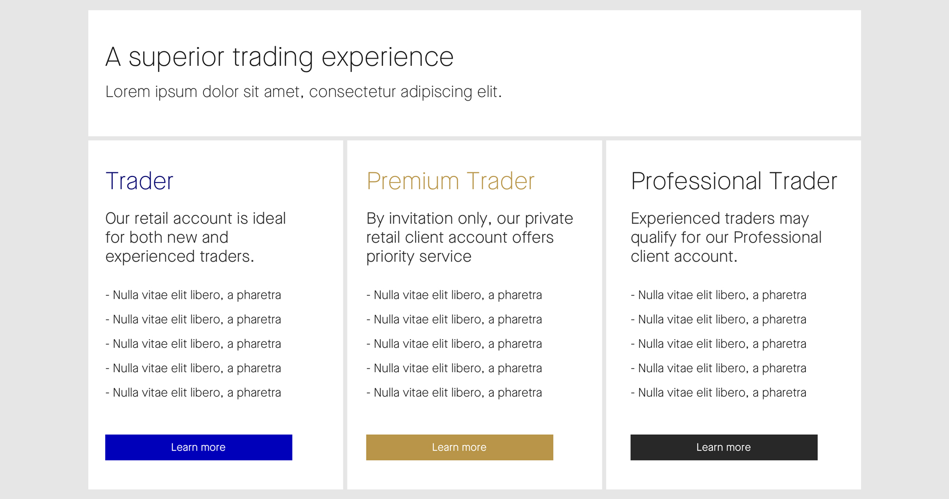


3b. Landing page design (mobile screen)







Email templates
Recognising that email is a critical touchpoint for client engagement, I aimed to ensure that our email communications were consistent with our refreshed brand identity and provided an enhanced user experience.



Brand assets development
To unify the brand's visual language, I developed updated stationery designs — business cards, letterheads, and presentation templates—that reflected our refreshed aesthetics. I also created print and event billboards with bold visuals and clear messaging to enhance engagement. For digital platforms, I designed social media templates tailored for LinkedIn, Instagram, facilitating consistent branded content dissemination.
Additionally, I collaborated with marketing teams to produce advertising materials for third-party platforms, including digital banners and promotional graphics, ensuring a unified visual experience across all channels.